
The Catch Me If You Can Opening Titles
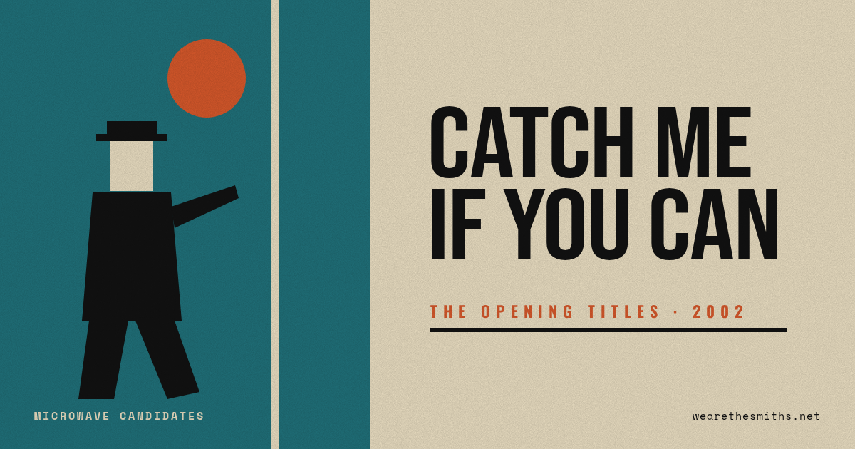
Since one of our first posts here was about kinetic typography, it’s only right that we finally talk about one of the best title sequences ever made.
Spielberg’s Catch Me If You Can (2002) opens with this little animated chase: flat, stamp-like figures sliding through a world built out of shapes and type, with a cop chasing a con man through airports, hotels and offices. It tells you the whole plot of the movie in two minutes, without a word of dialogue.
It was designed by Olivier Kuntzel and Florence Deygas, a design duo from Paris. DreamWorks wanted a European team to give it a 1960s, Saul Bass feel (Bass is the guy who did Vertigo, Psycho and Anatomy of a Murder), and you can see it everywhere: the limited colors, the hard-edged cutouts, the way the type moves as part of the scene instead of just sitting on top of it.
Put it together with John Williams’ jazzy, finger-snapping score and you’ve got the rare title sequence people don’t skip. As an editor, the thing I love most is the timing. Every cut and every move lands on the music, and the type is a character, not a credit.
[ Art of the Title ]
-Stew